


Should You Get Something Yellow?
How to wear the favorite color of summer 2025.
I shot this a while ago, and then kind of sat on it, because yellow is SO EVERYWHERE! To the extent that I believe there can be an it color, right now, yellow is it. It is the color of summer - maybe not every summer, but probably this summer.
99% of my ethos is do what feels good to you, don’t do what people tell you to do - but sometimes feeling current DOES feel good! And wearing a color (remember last summer or maybe the summer before when tomato red was inescapable?) is an easy and low investment way to feel current.
“But yellow doesn’t suit me!” “Yellow looks awful!” “Yellow makes me look ill!” Well, maybe that’s true. But maybe you haven’t found the right yellow, or the right way to wear it? Let’s see.
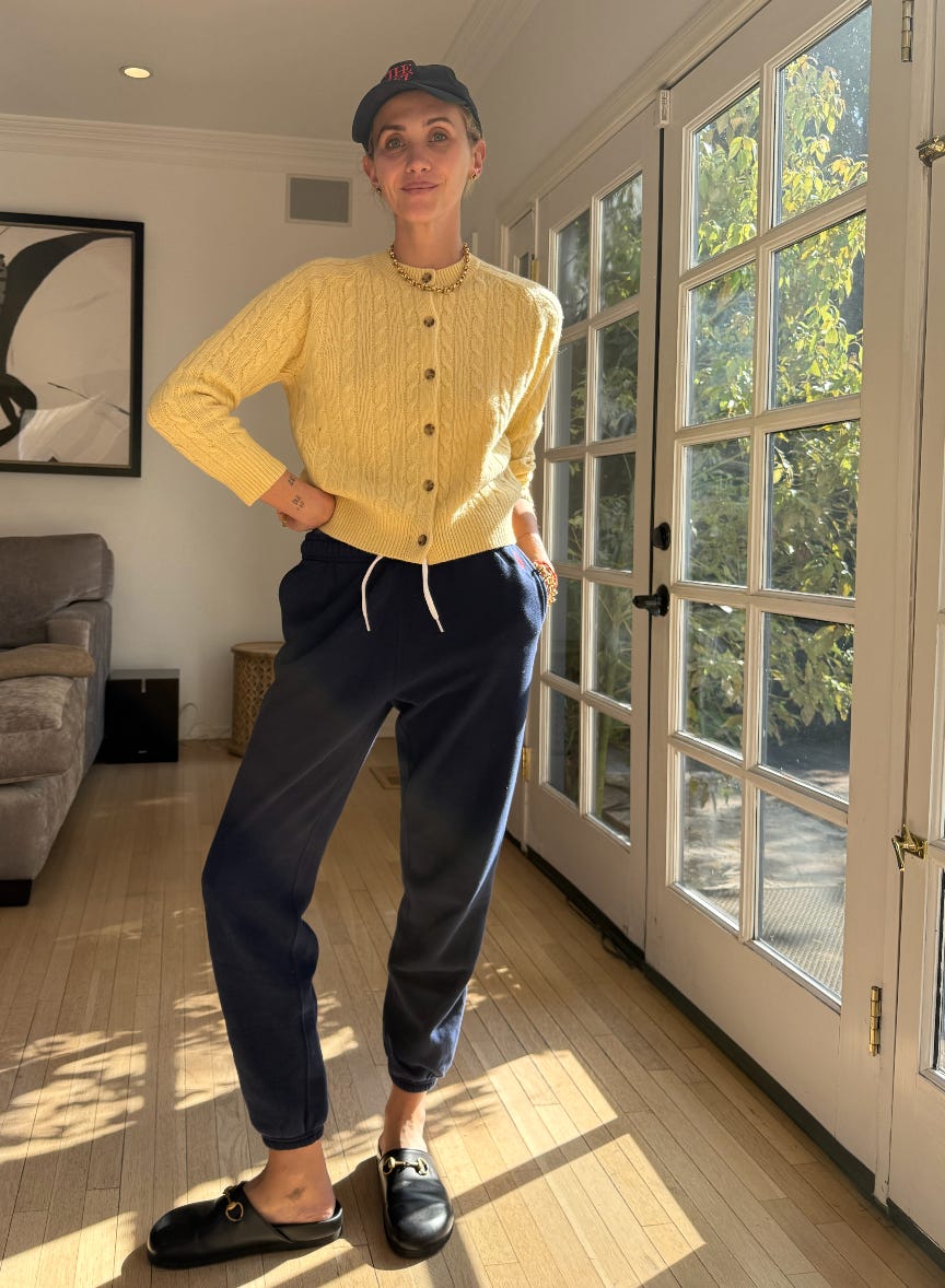
I’ve honestly always really liked yellow. It’s the official color of Earl Earl - it was my son’s favorite color from when he was 2-6, it goes a long way for giving something pedestrian a little juicyness. But the butter yellow that’s dominating this season is not my natural go-to. This Doen cardigan is butter yellow. It is so pretty, and is probably the most flattering option for pale skin tones. I like the preppyness and formality of it with my Polo sweat pants and clogs, but this is a look that took effort, despite seeming so casual. It took me a minute to work out which pants I like with the cardigan, and as it turns out, the answer is sweats.
I will say though, when you think about wearing a tricky color, normally one might think…pair it with a dark color or a neutral. But! As yee shall soon see, that makes the color stand out more. I’m into navy and yellow together, but it does nothing to make the yellow easier to swallow, if that’s your goal.

Meanwhile, this lime green crinkly satin skirt from ALC does something completely different from the navy. I always say color has to go with color, and in this case, the lime green and the pale yellow go like….lemons and limes. The brown loafers ground this and keep it from feeling too ~summer girl~. Mine are sold out, but this is the same shape just in black. However, I really think brown is best here (it’s a softer effect, not so severe), so try these, or you could also consider something like these.

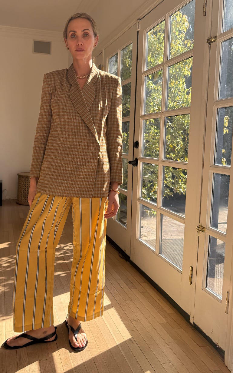
Ok, so the color of these Indress trousers is typically what I like. I like a very saturated orangey yellow. Something INTENSE and a little off, but also golden and sunny. Indress is one of my favorite brands - I wish they had more touchpoints in the US, but when you go to Paris, you should go. The yellow of the pants really brings out some creamyness of this Row blazer, and it all feels very rich and yummy to me.
I remember when I shot this feeling like I kind of hit my groove here with this gold Row blazer and yellow Donni pants - the colors work well together, but the prints do not make sense. It does not make sense to wear this really beautiful, really special, kind of shiny, iridescent linen blazer with these poplin pajama style pants. And yet! I love this. This is exactly the kind of combination I rely on to help me wear those truly special things, and make them feel more like real clothes than something straight out of a lookbook. When I put something like this on, I feel a little bit ~in a flow~… like this is MY personal style, and it almost stops making sense to shoot it for the newsletter because it is so personal - like, this works for me but maybe not for anyone else - but then it’s also so fun I can’t help myself.
I also think, sometimes when I give myself these little challenges, or some parameters to work within with styling, it does help me work through feeling stuck or in a rut. When the whole wardrobe is in play and you’re just like…ok…do something great, it’s overwhelming. But to say, ok, do something great that is yellow, or silk, or sporty, or whatever, it starts to feel like an exercise and it gets inspiring. does that make sense?
Keep reading with a 7-day free trial
Subscribe to Earl Earl by Laurel Pantin to keep reading this post and get 7 days of free access to the full post archives.